The Astro Haze theme is built on several core design principles that create a cohesive and beautiful user experience. Let’s explore these principles and how they shape the theme.
Glassmorphism at its Core
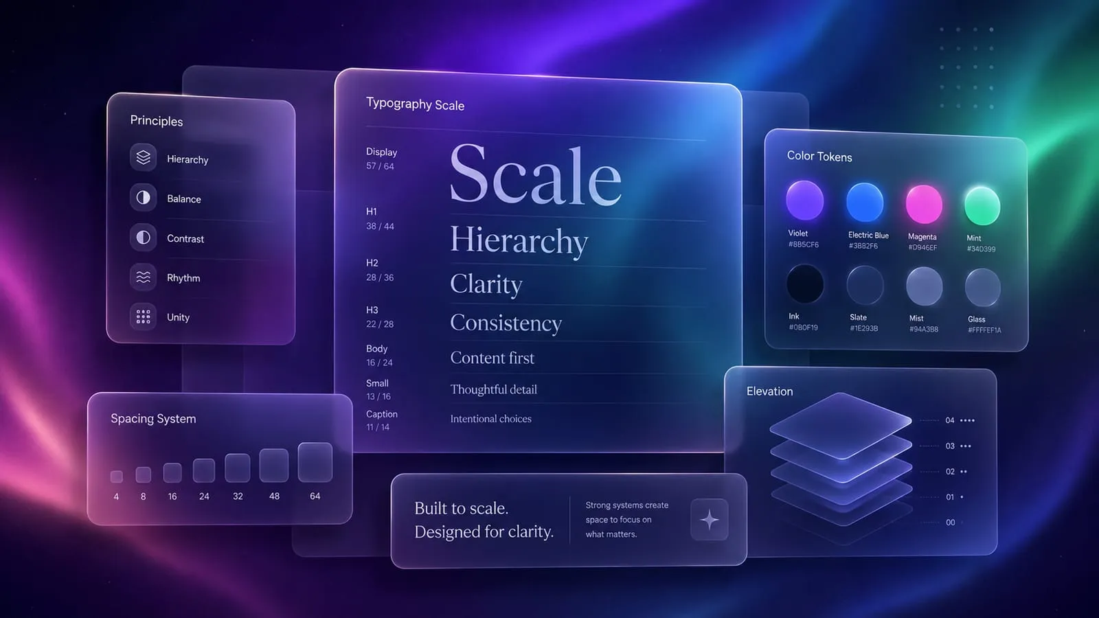
Glassmorphism is more than just a trend—it’s a design language that creates depth and hierarchy through transparency and blur effects.
Key Elements
- Background Blur: Creates the frosted glass effect
- Transparency: Allows content layering
- Subtle Borders: Defines edges with light strokes
- Vivid Colors: Enhanced through the glass effect
Visual Hierarchy
We use several techniques to establish clear visual hierarchy:
- Contrast: Between glass panels and content
- Size: Larger elements draw attention first
- Color: Accent colors guide the eye
- Space: Generous spacing improves readability
Performance Considerations
While glassmorphism can be resource-intensive, we’ve optimized for performance:
/* Optimized glass effect */
.glass {
  backdrop-filter: blur(12px);
  -webkit-backdrop-filter: blur(12px);
  will-change: transform;
}
Performance Tips
- Limit the number of blurred elements
- Use
will-changesparingly - Provide fallbacks for older browsers
- Optimize images with modern formats
Accessibility First
Beautiful design should be accessible to everyone:
- Color Contrast: WCAG AA compliance
- Keyboard Navigation: Full keyboard support
- Screen Readers: Proper ARIA labels
- Reduced Motion: Respects user preferences
Responsive Design
The theme adapts seamlessly across devices:
| Breakpoint | Description |
|---|---|
| Mobile | < 768px |
| Tablet | 768px - 1024px |
| Desktop | > 1024px |
Color Philosophy
Our color system is designed for flexibility:
- Primary: Brand identity
- Accent: Interactive elements
- Neutral: Content and backgrounds
- Semantic: Success, warning, error states
Conclusion
Astro Haze demonstrates that modern web design can be both beautiful and functional. By adhering to these principles, we’ve created a theme that’s not just visually striking, but also performant, accessible, and user-friendly.